Interaction
Interaction
Perhaps the most well known and dominant aspect of UX, it has been described as
“the design of behavior, positioned as dialogue between a person and an artifact. A person commonly doesn’t talk to an object; they use it, touch it, manipulate it, and control it. Usage, touching, manipulation and control are all dialogical acts, unspoken but conversational.” – Jon Kolko
and also...
“a design discipline dedicated to defining the behavior of artifacts, environments, and systems (i.e., products)”. - Robert Reimann
Undoubtedly interaction design is a design discipline that has become a defining element of UX. Though the preceding two quotes assert the alignment with a user’s behaviour they do so here in relation to their interaction (the person and the artifact).
In other words it is the behaviour of the object in relation to the user. The following principles reassert this notion that many interaction design issues are born out of preconceptions of what a user expects to be able to do with the interface they are presented with.
Principles
Progressive disclosure
Good interfaces display this all the time. By only revealing necessary information at a specific point on the user journey, or within a specific context, the tasks presented are relevant. This is a type of layering , but in the case of the interface, the layers are interactions. In the physical world we see this exhibited on road signs as we reach a destination. In sign up forms, revealing necessary steps in stages to allow an easier route to completing a form.
Affordance
In design, affordance is defined as the properties an object or environment has that defines its usage. The hammer is a very basic example. For hitting nails, it is the best tool for the job - a handle to pick it up and a heavy end to hit a nail with.
In website design affordance is perceived and describes how interactive elements showcase functionality and how an element looks indicates use. The input field, the carousel, the scroll bar all have a way of describing their interactive qualities. But it is important to remember they are perceived, in other words prior knowledge has been gleaned somewhere before a user fully understands how these elements act within a web browser.
This is important to consider when using new interactive paradigms - there may be no prior experience that a user can take from, which will result in initial poor usability. However the experience of the product may eventually be better once the interaction has been learnt.
An example of perceived affordance and the glitch with usability could be seen in (the now defunct) Google Wave’s scrollbar. Though it works a little like a normal scrollbar, it grows with the length of a list and has an elasticity to its behaviour. The purpose is to save space but see what one user thinks;
‘I'd be content with an option to use normal scrollbars.
For me, the issue is that scrollbars are easy and don't need to be reinvented; at the risk of sounding Luddite somehow (though how Luddite can I be, being a Wave early adopter?) there was nothing wrong with the standard widgets, and Google didn't need to make changes.
Second, they break the rule of "don't move the controls around." I don't want to have to go find the scroll arrows again.
As it is, I avoid using them whenever possible.’
Confirmation, Errors and Forgiveness
The avoidance of errors online is a major consideration especially when one considers the increasingly important role websites have to play in tasks that are important. The online vote for a general election may not be too far away but the system for the voting paper would need to be designed to minimize user errors and allow a user to navigate and be clear in their actions.
These three qualities are all closely linked and are in fact related to a user’s mistake. It is widely accepted that errors will be made, and the system must forgive these faults. One way is to ensure a confirmation stage is instilled before a deletion or a payment. Past this point of confirmation it is easy to see how the user’s experience of a service can be rated in terms of forgiveness. If you have mistakenly paid for an item how easy is it to regain your money? If you have deleted a record can you undo?
An optimal pattern of interaction maybe that the user decides on an action, the system asks the user to confirm it. The user confirms but realises their error and the system ‘forgives’ the mistake by allowing them to rectify the issue. How many systems do not allow this to happen? Many online banks, for example, will not reverse a confirmed payment without a call to customer services.
Fitts law
Size and location of interactive items (eg buttons) can denote an ease and speed of use. The smaller and more distant the area of interaction, the longer it takes to move from a resting position to the target and accuracy is also affected if speed and distance is a factor. However in touch screen technology the extra dimension of what you are pointing with, (in this case the finger) plays a part in this principle. Moving objects with the finger can become tiresome if repetitive, and Fitts Law again plays a role by the ensuring the least amount of effort is required when interacting with an interface.
Constraints
In the interface a physical constrain can be seen in the slider to select appropriate parameters (price available for flights for example) or in form input fields with the radio button (select one) or the check box (select one or many of several options). The screen is also a physical constraint and leads to the inevitable frame effect on the design of a page. However Windows 7 for mobile and the iPad see the screen more as a window to look through at the content than a frame to be bound by. Used well constraints will simplify and reduce errors by improving usability.
Control
The principle of allowing a user control over a system regardless of their proficiency or experience. ‘Expert’ modes allow advanced features to be made use of but should never inhibit the minimum requirements of operating the interface and getting expected responses from it. The advanced user is considered the secondary audience where popular interfaces (such as on a web browser) are seen.
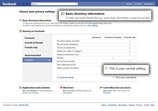
Facebook has struggled with confusion over it’s public and private settings. The line between shared and private information is undefined and as a result disconcerting to users. In an effort to address this the security settings have undergone a redesign - to give control back in a way that is clearer to the user.
Many feel that by using a service they should not feel violated by their interaction with it but unfortunately as a design exercise the failings are still evident and have led to many giving up their profiles. The design still fails to communicate effectively which privacy settings apply to areas of a profile and at the time of writing this post, basic information design rules have still not been observed.
Cost benefit
Activity (and interactivity) will be pursued by a user only if the benefits are greater than the costs. The costs in this case are typically time and attention spent by the user. Advertising is a typical annoyance but only when deemed irrelevant. In the proper context the cost benefit is increased and will likely lead to increased results.
Sometimes, as in the case of Flickr, the tools developed end up being of more value than the product itself. Flickr was originally a component of Game Neverending, an online multiplayer game produced by the Canadian company Ludicorp.

The image sharing component of the game became Flickr as it was deemed a more feasible project. The cost invested in producing an element of the interface resulted in a massive benefit for the company who sold to Yahoo!
However this good fortune is a rarity in design, where features often have little cost benefit, are expensive and drain resources of a development group. One must be mindful of the impact of spending energy on elements with little discernible value to the user - they run the risk of being expensive distractions and potentially harmful to the user experience.
Such is the established nature of the discipline of interaction design, that you easily forget that the design principles at its foundation have been in existence as a core of product design for decades. Interaction as a component of UX is vital but it is important to view all the elements as part of the cohesive whole. Designing with user's experiences in mind effectively means that all areas of the UX design framework need to be taken into account to give the best results. UX is a part of good design practice and should not be treated as a separate entity.
In the final part of the series, Content is introduced. The reason for the journey that a user has experienced to get to the object that they want to read, see, listen to or play with.